design • 01.12.2023
How to choose colors for website design?
The success and popularity of the site depends on the literacy of the choice of the color scheme for the site. Modern marketers and SEO specialists have long learned to combine colors for advertising purposes.

How does color affect the perception of your site?
Each shade is able to have a certain effect on the human psyche.
For the site, it is necessary to select a certain color scheme, starting from its theme. A striking example of the successful use of color can be the well-known Coca-Cola drink. Its label has a bright red color, which not only attracts attention, stands out favorably against the background of many other colors, but also arouses interest and sympathy among people.
The correct color design for a website is not only about attracting a large number of visitors, but also the ability to create a completely unique and memorable brand.
Choosing a dominant color
The choice of primary colors for the company's website, brand and logo should be based on the specifics of the activity. It is important that the color evokes direct associations with the company in the audience.
Every large company has its own color combinations for a reason. They are an important part of your marketing strategy. To understand how to use colors wisely for a website, you need to study their effect on and the effect they have on people.
Dark blue and turquoise hues appeal to buyers with little financial potential. These colors can be seen in banks and shopping malls.
Bright blue, black or red-orange are attractive to active and emotional buyers. These colors are used by fast foods and shops during sales.
Pink and crimson appeal to the average consumer and don't have a specific purpose to use.
Experienced marketers use a variety of color combinations to more effectively attract customers and buyers.
What color should you use for your website?
In order for the site to attract the right audience and convey the correct message to visitors, it is necessary to correctly choose the main color for its design:
Represents nature, health and wealth. The color is pleasing to the eye and therefore easier on site visitors.
Symbolizes life, youth and optimism. It is best used on sites targeting youth.
Attracts creative and friendly people. This color encourages action.
Can become both a symbol of passion and energy and danger. As a rule, it is used to instantly make a person want to perform some action on the site.
Is associated exclusively with the feminine theme. Therefore, it is often used on sites for women.
Is a symbol of wealth, success and wisdom. This color has an extremely calming effect on people.
Symbolizes stability, reliability and security. The color is versatile and attracts both men and women alike.
Is a calm color that embodies simplicity and clarity.
Indicates solidity, elegance and luxury. Used to promote premium goods.
Selection of colors for the site by spectral circle :
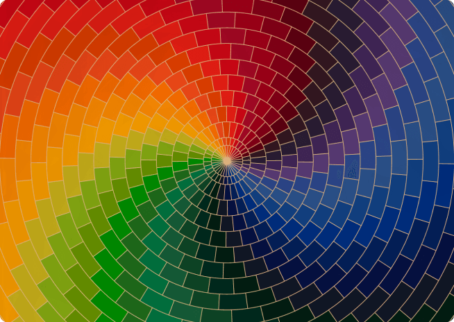
To use colors more efficiently and create the right combinations, a color wheel has been developed, in which tones and halftones follow one after another, from warm to colder.
You can work with a circle according to the principle of triad, double system, analogy, separate, rectangle and square.