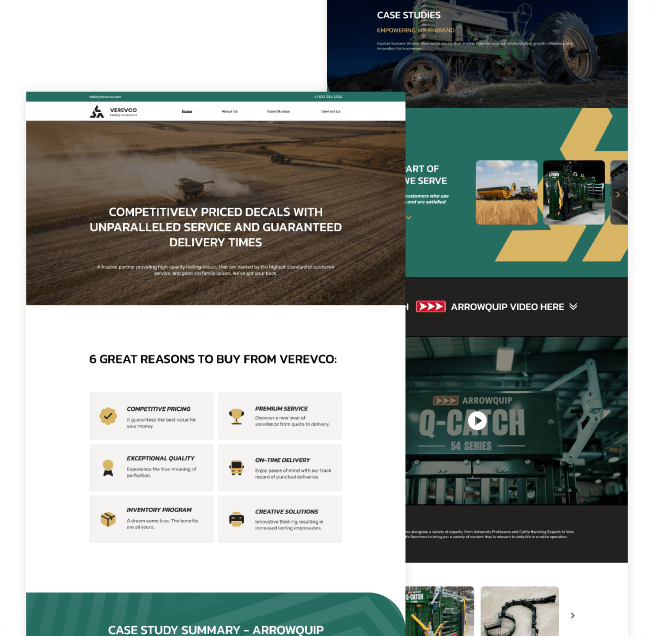
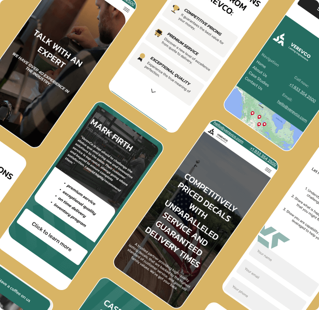
VerevCo
About the project
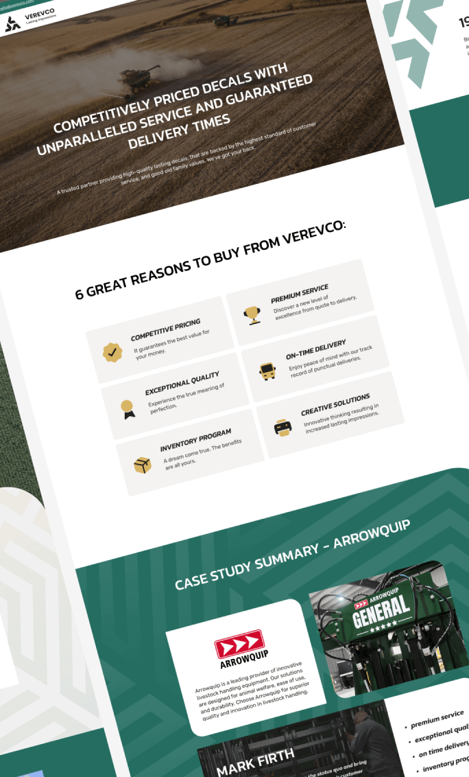
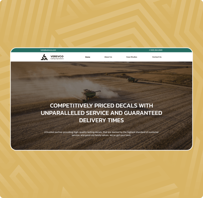
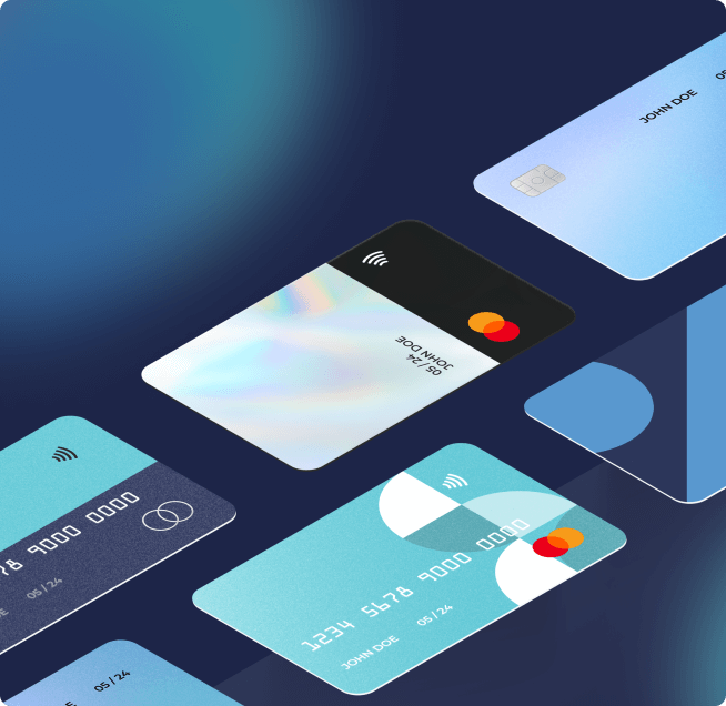
We had an opportunity of collaborating with Verevco, a trusted partner known for delivering high-quality, durable stickers backed by the highest standards of customer service and timeless family values.
In crafting Verevco's website, our team focused on creating a visually appealing and user-friendly platform. The design aimed to reflect the reliability and durability of Verevco's products while ensuring a seamless and engaging user experience. The goal of presentation was to leave a lasting impression on clients and partners, emphasizing Verevco's commitment to quality and customer satisfaction. Developing the brand book involved capturing the essence of Verevco's identity.
Overall, our collaboration with Verevco was centered on translating their values into a digital presence. By combining innovative web design, a comprehensive brand book, an impactful presentation, and website development, we aimed to elevate Verevco's online identity and contribute to their continued success in delivering top-tier products and service to their clients.
What we did
- • Web Design
- • UX/UI Design
- • Brand Identity
- • Social Media
- • Custom Animation
- • Development
Thank you for contributing to the success of Verevco and for being a reliable partner in bringing our brand to new heights!
- PETE LINE,
CO-FOUNDER | CEO
Browse more projects
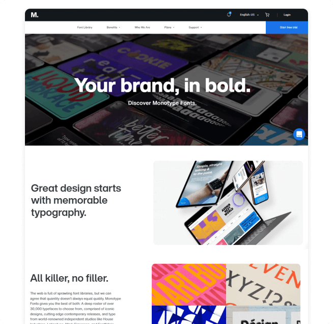
Our company had the opportunity to collaborate with the well-known company Monotype on a project focusing on the redesign of their website. Our work was specifically centered around web design, where we aimed to create a modern, user-friendly, and aesthetically pleasing interface.
We studied the unique features and values of Monotype to incorporate them into the website design. Working with innovative design solutions allowed us to create not only an attractive but also a functional space for visitors.
A crucial part of our task was ensuring alignment between the design and Monotype's corporate identity, creating a unified and easily recognizable style.
Our goal was not just to meet the client's expectations but to surpass them by delivering a contemporary and innovative web design that reflects the impact and authority of Monotype in the field of fonts and text technologies.
Our project for Magic company aimed at combining both technological and creative aspects. The presentation and logo likely reflected not only aesthetic considerations but also the mathematical principles that underlie their approach to marketing. With experience from SpaceX to ANZ Bank, Magic is the result of a successful experiment: combining mathematical principles with media expertise to help brands navigate in the increasingly complex world of web3.0 and beyond.
As for the logo, it was designed to mirror the mathematical complexity and technical depth of Magic's approach to marketing. Graphic elements included abstract forms symbolizing the use of algorithms and data analysis.
When the founders of Lateenz partnered with Design in DC, their magazine was a brand-new venture in need of an online platform. The goal was to draw Latinx middle and high schoolers with stimulating content, then enable them to contribute material, form a community and make use of education- and career-related resources. Lateenz also needed to attract advertisers, to support the costs of maintaining the website and giving awards to teens contributing to the site.
Using bright colors, playful graphics and vibrant typography, DDC designed a site that is both youth-friendly and easy to navigate. The content, divided into several categories, is also well-curated and effectively organized.