design • 01.12.2023
10 golden rules for typography designers
A competent web designer should definitely know the basic rules of typography. A good specialist is always aware of new trends and popular trends in modern typography. From the entire list of techniques that web designers use in their work, there are 10 most important rules of typography:

Standard fonts are the best
It's always fun to use something new and creative. However, this may not always be beneficial. Studying even very important information presented in a non-standard form, the user can be distracted by its presentation, forgetting about the content.
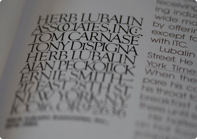
Two or three fonts are enough for one site
Using a lot of different fonts on the same site will make it look like an inexperienced beginner's job. The interest of users in such a project will be noticeably lower than in a similar resource, but with a more serious design.
Don't use Caps Lock
It is highly discouraged to use large print to focus the reader's attention on some blocks of the site. The majority of users perceive such “voice raising” extremely negatively.
Play in contrast
To accentuate the main ideas and competently switch the user's attention from one type of information to another, use a contrasting text highlighting against the general background. The optimal contrast ratio is 4: 1.
Consider line lengths
Very long and very short lines of text are not perceived in the best way by users. Especially when there are most of these lines. The most attractive line length for the desktop version of sites is considered to be 60 characters, a line of 40 or 70 characters can also be optimal.
Discard orphans
The use of top and bottom orphans on the site is not recommended. You can remove them using line breaks or letter spacing.

Consider line spacing
The most comfortable text for the user will be text that has good line spacing. The ideal interval is considered to be equal to 130-150% of the character height.
Pay attention to the mobile version of the site
Most modern users explore websites from their mobile devices. And this must be taken into account. It is important not only to reduce the regular version of the site to fit the mobile one, but also to develop a design for it with special typographic rules. These rules must also be taken into account when developing a corporate identity for a company.
Don't use hyphenation
Text with a lot of hyphenation is visually more difficult to perceive. Therefore, it is recommended to refuse transfers.
Ditch the Comic Sans font
The inappropriate use of the Comic Sans font has already caused quite a stir on the internet. Do not create anti-advertising for yourself with inappropriate use of fonts on the site.