marketing • 01.12.2023
Five myths about homepage design
Publishers fill the home page with important content, post conversion elements (value proposition, lead form, CTA buttons with calls to action). What about users? They often skip it altogether. In this article, you will learn about which homepage design myths you need to forget about in order to increase conversions.
Myth one: the first impression is important, so the home page should shine
Myth two: home page gets the most views
Myth three: the main page is the "face" of your site
Myth four: the home page should reflect the value proposition.
Myth five: all offers in one place
Myth one: the first impression is important, so the home page should shine
If you rummage through the site statistics, you can see that users most often come to your home page from social networks or via referral links. From search engines, people go straight to where they want to be: to a page with an article or product description.
The home page is just a step in the user's journey. They want to get to specifics faster, especially in e-commerce.
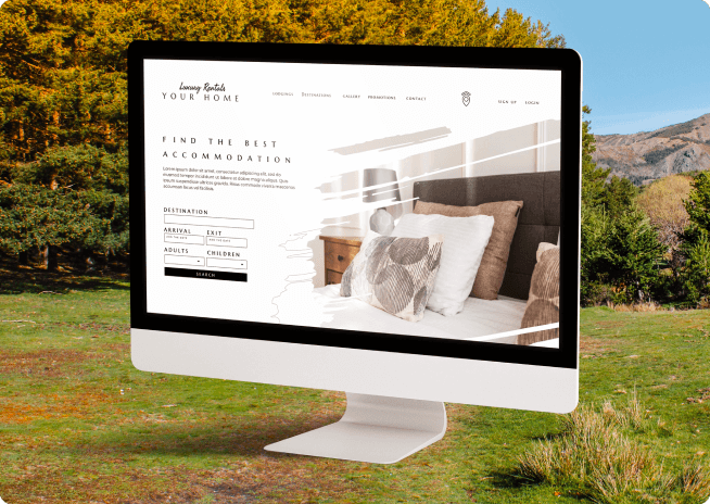
Take a look at Intel's site from 2013: complex domain, lots of content for different users. Since they have a lot of users and they all have different needs, the company immediately finds out why the person came to the site. Here is a suitable slogan: "Start your search here."
In 2015, Intel redesigned it to offer better content. This expresses concern for users who need help or new drivers. For new buyers, there is an online store and a feature to compare different devices.
Myth two: home page gets the most views
Check how much time your visitors spend on different pages of your site. Surely the main one is far from the leader on this list. Visitors use the site as they like.
What does it mean? The fact that each page on the site has its own purpose. Study the statistics and try to understand why users often visit certain pages.
Myth three: the main page is the "face" of your site
Everything must be balanced. If a page falls out of the picture, it does not generate conversions. This often happens when different sections are developed by different designers.
First, work on the key elements - fonts, colors, header. They can then be used throughout the site. Develop a general interface architecture, and the home page will grow by itself.
Myth four: the home page should reflect the value proposition.
The tagline on the SurveyMonkey home page reads: Create Polls, Get Answers. Simple, clear, for sure.
Benefits of the company's products are mentioned on their description page: "Get answers with the most popular survey platform."
Messages that are located in different places of the site and fold into a mosaic are the highest aerobatics of a digital marketer. SurveyMonkey is streaming a value proposition on every page, and rightly so.
Don't expect a visitor to be satisfied with one block on the homepage. Let it not matter where they "landed". Benefits and values must be visible at any point.
Myth five: all offers in one place
A little about everything is the most effective principle. MailChimp Case Study 2012: "Look at all our offerings."
Lots of useful things in one place: new items, explanations of the service. An example of mailings and lists, news subscription form.
Too many options are annoying and confusing - difficult to choose from. And if there are no options at all or very few, then people become interested in what the snag and the catch are.
Do not believe myths, test new ideas, and high conversions for you!